Dear FME’ers,
Well, it’s the time of the year when the snow starts to fall for the winter*, and thoughts turn to skiing, hot chocolate, and the upcoming release of a new version of FME. So it is that I get to sit by a warm fire and pick my top ten favourite Workbench updates for this time around.
And FME 2014 does not disappoint. Despite – or maybe because of – switching to a new, Mac-friendly technology to render the canvas, we’ve managed to add some excellent new functionality. In fact the whole look and feel is now distinctly chic and elegant, as if we should really launch it with a snowy photoshoot on the cultured streets of Paris, rather than in an online webinar hosted overlooking a parking lot.
Oh well, when you download it for the first time, be sure to close your eyes, listen to some classy jazz, and imagine yourself strolling along the banks of the Seine!
* For the southern hemisphere substitute “Just as the English wickets start to fall in the Ashes…”
![]()

Transformer Updates
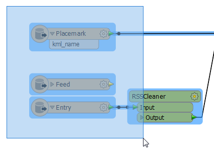
I’m not talking about transformer functionality here (that’s a whole different article) but how transformers are rendered on the Workbench canvas. Some changes are obvious, some so subtle I didn’t even notice, even after using them for weeks. Take a look at this screenshot:
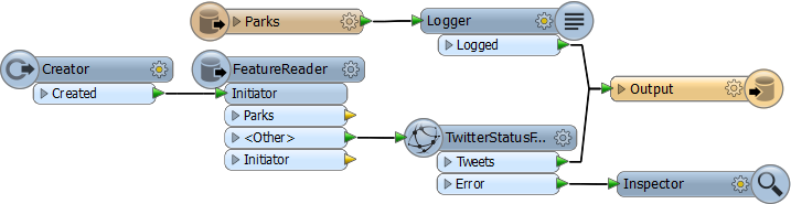
First you’ll notice that transformers (and feature types) have been given an added “decoration”. We haven’t done this for all transformers, just ones where we wanted to emphasize that something special is happening, for example where data is being read or written, or is being fetched over a web connection. The location (on the right or left side of the transformer) tells you whether it’s an incoming or outgoing process. Feature types have the same new decoration too.
Another obvious spot is that the input and output ports are now labelled in lower case (well CamelCase to be precise) which is way better than us shouting OUTPUT at you!
And one less obvious item: look at the Twitter transformer above. Notice anything? Sure? Look closer….. OK, maybe you see it, maybe you don’t. I didn’t notice at first. Where has the “Input” port gone?! Well, we removed it for all transformers that had only a single Input port. What it does is free up space in the canvas. It sounds (or sounded to me) like such a bad idea, and yet, when you see it, it’s so elegant and obvious that I can’t imagine why we didn’t think of it before!
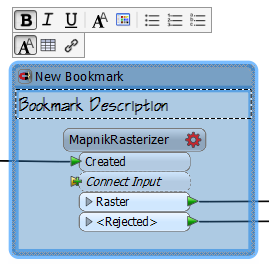
Speaking of input ports, my final update for transformers is what we call “dynamic ports”. There are a few transformers that had no input or output ports by default, but needed them to be added by the user. What we’ve done there is add a single input; when connected, another appears automatically. Take this InlineQuerier as an example:
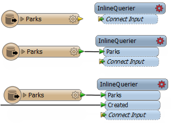
Notice that as I connect further inputs to it, a new port is automatically added, so that I always have something to connect to. The MapnikRasterizer and MapTextLabeller transformers also have this capability, and we can add it to any other transformers that have a variable number of input ports.
Tip: Did you know that you can double-click a transformer to open the parameters dialog? This functionality was added as a 2013 Service Pack item.
![]()
Connection Lines
It seems odd that we would want to revisit connections between objects – they’re just lines! – but the new rendering technology enabled us to make a couple of worthwhile updates.
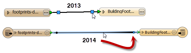
Firstly, noticed that the connection lines are now rendered as “anti-aliased”. What that means is that they aren’t drawn like a series of steps, but as a smooth line. Perhaps a screenshot will help explain:
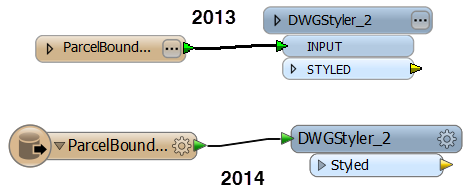
Notice how the 2013 connection was more “stepped”. You’d really have to jiggle objects about to make that line truly straight. So for folks (like me) that get really uptight about making straight line connections, this is a real time-saver. It’s much easier to get things looking lined up than in 2013.
The other update we made to connections was in moving them about. In 2013 and previous releases, you would have to grab the handle on a connection to move it, but in 2014 you can click anywhere on a connection and start to move it about:
When you try this, notice how the nearest node to the mouse is automatically highlighted in blue, and the connection line has a thickening gradient to guide you to what is going to be moved. Dale calls it “the fox” in homage to this forgettable piece of sports broadcast technology.
![]()
Pop-Up Buttons
Combining both of the previous items – transformers and connections – leads me on to another cool update. You already know we have a drag-and-insert tool (whose pink spot is now a pink triangle, by the way) and for simple 1-input/1-output transformers the functionality behaves the same in 2014.
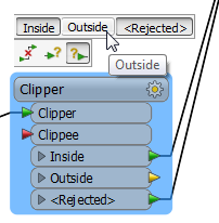
But when you insert a multi-port transformer something rather more marvelous happens:

Yes, instead of having a dialog open in which to define the ports to connect, we now have a little pop-up button.
The left-hand button basically means “I’ve made a mistake and don’t want to connect this transformer”. Click it and the transformer will be disconnected from where it lies. In fact, you’ll get that on any transformer you insert.
The other two buttons represent incoming and outgoing ports and are only for multi-port transformers. By clicking on them you get a list of ports and can choose which to connect:
Of course, the really nice thing there is that you are just setting these directly on the canvas; you aren’t having to open and close a dialog. I think (and hope you agree) this is the sort of functionality that gives FME the easy-to-use interface that it has.
Tip: Don’t forget you can use drag-and-insert and a transformer that’s already inserted! This very short video clip shows an example of doing just that (and using the new pop-up buttons).
![]()
Annotation
Updates to the annotation (label) functionality could produce the biggest changes to how a workspace looks, and yet it’s all up to you if and how you use it.
Basically, annotation is now rich, rather than plain, text. You can assign a font, a font color, or a font size; change the background color; or even add tables and hyperlinks. This is done through a pop-up menu that appears when you start to edit an annotation:
So with these tools the fairly boring text above could become:
What might not be apparent is that the background color can be made semi-transparent and that there is also an option to turn word-wrapping on or off. Text can be bolded, italicized, or underlined; and you can even add bullet points (as bullets, numbers, or letters). Oh, and fair warning: if you use ‘Comic Sans’ font, your FME license is automatically revoked! Sorry, that’s just how it is 🙂
Tip: Don’t forget you can select Tools > FME Options > Appearance and use the tools there to change the font for all objects on the canvas; and the log window too!
![]()
Bookmarks
The updates to bookmarks are probably less dramatic than for annotation, as we’ve tried to keep their behaviour as close as possible to what it was before. Still, there are some changes.
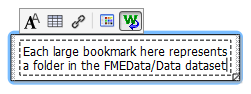
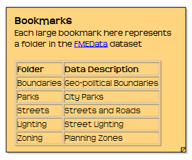
Firstly, the description can have the same sort of formatting applied as annotation:
Secondly, like with the new selection tool, objects are deemed to be within a bookmark even if they only overlap and are not fully contained, like this example that picks up and moves the Clipper transformer:

Tip: Bookmarks are now placed with their magnet turned off by default. That means you won’t place a bookmark and accidentally pick up other features. You can move and rearrange it to fit before turning the magnet on.
![]()
Edit Attribute Valu e
e
This is an interesting update, and one you’ll need to know about when you open an older workspace in 2014.
In brief, the update is that we’ve removed the functionality for constant values (which used to look like this):
…and replaced it with a new “Edit Value” tool. When you open your old workspace in 2014, constants will be replaced with functionality like this:
Why have we done this? Well, it was to add the ability to construct or compute a value, rather than just entering a constant. You can change (or add) attribute values by right-clicking the attribute and choosing Edit Value:
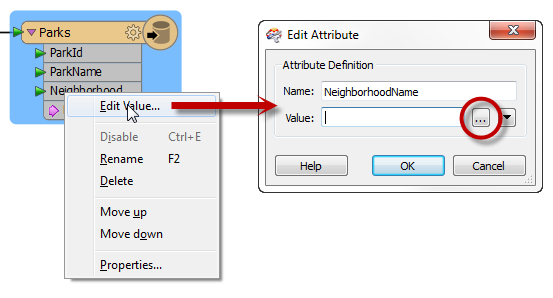
This will let you enter a constant value as before, or you can use the […] button to open an editing window, or you can use any of the options on the drop-down menu:
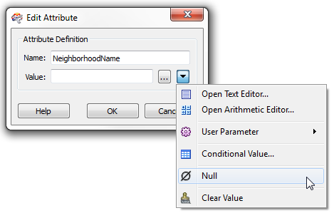
So now a “constant” is anything but constant. It can be constructed with a text editor, computed with an arithmetic editor, set to a user parameter, have a conditional value, set to null (yes, a real null), or emptied completely.
Tip: Did you look closely at the “expand” arrow on the Writer feature type above? Yes, it is colored pink. This is to show you that some items are set this way, even when the list of attributes is closed. Similarly, it will be red if there is an attribute not receiving a value (and therefore with a red port).
![]()
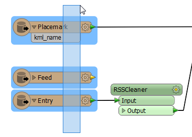
Dataset Parameter
Right-click a Reader feature type and you’ll find a new option on the context menu:

Despite how it sounds, you won’t be editing the file contents, just setting the source dataset. In short, this is a shortcut to the “Source Dataset” parameter in the Navigator window.
Why have we done this? Well, the first reason is because a shortcut is always good! At least I think so. This is a great way to make a change without having to browse through the Navigator window to find the right parameter. We feel the canvas should be the main focus of your attention, and the more you can get done without leaving the canvas, the better.
But, more than that, we’d seen some new users have difficulty understanding the link between the Writer in the Navigator window and the Feature Type object on the canvas. So this is an attempt to make that relationship more apparent. In future I think we’ll try and highlight that a bit more, by maybe color-coding them, or having one highlight when you click the other. Something like that. If you have any ideas, let us know.
![]()
Help Window
This is definitely one of my favourite updates. If you’re looking for the window labelled “Transformer Description” in 2014, then you’ll find it has now simply been relabeled to “Help”.
OK. That’s not particularly great in itself, but the reason it was renamed is….. ALL objects in the canvas now provide information in that window when they are clicked on. For example, click on a feature type and the Readers and Writers help appears in the window for that particular format.
Similarly, if you click on a object like a bookmark or annotation, that too brings up the relevant help section from the FME Workbench documentation:
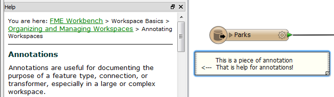
So now there is basically a shortcut from any object to the help documentation for that object (and you know how I like shortcuts!).
Tip: When the cursor focus is on the Help window, Alt+Left Arrow, and Alt+Right Arrow, can be used for navigating back and forth between previously viewed items.
![]()
Collapsible Parameter Panels
We’re getting close to the end of the list now, so let’s keep this one brief.
Some transformer parameter dialogs were getting too long; in fact some had so many parameters that the dialog might not fit on the screen any more. So what we did in 2014 (actually a 2013 Service Pack, but who’s checking?) was to implement sections of parameters that could be collapsed. For example, take the DWGStyler:
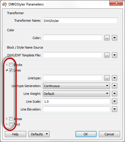
Here the parameters have been grouped into Blocks, Lines, Areas, and Text so that you can open the parameters to style only the geometries you have. You no longer have to wade through a bunch of block parameters when you really want to style text features. Similarly we’ve implemented check boxes so those values can be all greyed out unless you choose to set them.
We’ve reviewed most transformers and made this update where we thought it was necessary. If you think we’ve missed any out, then let us know.
![]()
Selection Tool
The final one in my list revolves around the changes made to the selection tool and cursor.
The first is such a small thing, but with a big impact. In brief, a selection envelope picks up any object that overlaps, not just ones fully inside. As an example, look at this screenshot:
In FME2013 I’d have to draw the envelope around the entire set of feature types to select them all. In FME2014, I don’t need to do that. Just having the envelope overlap them is enough to select everything.
I realize this is a change in behaviour that might cause a little confusion at first, if you draw the envelope around the objects and pick up something else by mistake, like this:
So you’ll have to be careful about this at first, particularly when you are selecting items for deletion, because (for example) if you have a connection line passing through the middle of a bunch of transformers you can select and delete that by mistake. But trust me, the learning curve isn’t steep and when you get used to this behaviour, it is better than before. I’ve been using FME for nearly ten years now, so I’m not just saying that – I find this way more useful.
One other change with the selection tool – when you are in zoom and pan mode, the right-click mouse button now reverts into selection mode (instead of opening a context menu). It’s basically a short-cut so you don’t have to go back to the toolbar to switch back and forth between windowing and selection. In the Data Inspector we set up the <Shift> and <Ctrl> keys to change from selection to zoom-in/zoom-out; we just can’t do the same in Workbench because those keys have other uses. So this is as close as we can get.
Update: Since the time of writing, this behaviour has been reverted, but can be turned on under Tools > FME Options. Personally I’d go and turn it on straight away and if you ever want to use the old method of selecting objects (i.e. the object has to be fully in a selection envelope) then simply press the <Alt> key while you are drawing the envelope.
![]()
I just wanted to end this article with a shout out to my Pro Services colleagues, the Build-and-Release team, and of course to our developers too. FME 2014 represents a huge update to our product and – even with the great features described here – not all of the effort is apparent from the user point of view. You can take it from me that the work was far-reaching and arduous (in fact I recommend all GIS folks work for a software company at some point, it is so enlightening).
It’s a privilege to work with you all, and an honor to get to present your efforts to our customers via this blog.
Mark


Mark Ireland
Mark, aka iMark, is the FME Evangelist (est. 2004) and has a passion for FME Training. He likes being able to help people understand and use technology in new and interesting ways. One of his other passions is football (aka. Soccer). He likes both technology and soccer so much that he wrote an article about the two together! Who would’ve thought? (Answer: iMark)